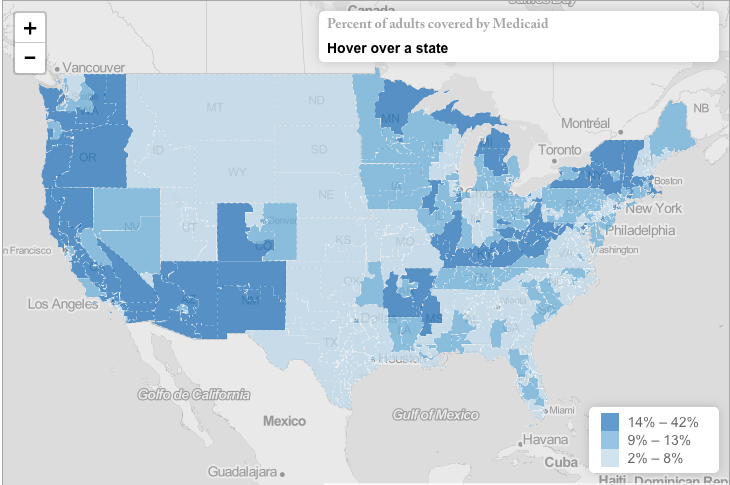
We have a new interactive map feature on our website and are excited to share with you the first maps we have created with our new tool. The maps visually display how Medicaid and the Children’s Health Insurance Program (CHIP) are helping to meet the needs of children and families across the country. You can see how many children and adults rely on Medicaid (and in the case of children, CHIP) by congressional district. You can zoom out and see how your district compares to other parts of the country or download a state-specific handout to see the full break-out of sources of health care coverage by district in your entire state.
Check out the children’s map and the adults’ map.
The maps use data from the 2015 American Community Survey (ACS). We hope they are useful. We are looking forward to creating more maps for you focusing on county-level data in the coming months.


